Skip to content
New issue

Have a question about this project? Sign up for a free GitHub account to open an issue and contact its maintainers and the community.

By clicking “Sign up for GitHub”, you agree to our terms of service and privacy statement. We’ll occasionally send you account related emails.

Already on GitHub? Sign in to your account

Low-contrast text is not accessible #1640

Open
jrobbins opened this issue Nov 6, 2019 · 6 comments
Open

Low-contrast text is not accessible #1640

jrobbins opened this issue Nov 6, 2019 · 6 comments
Labels
🐤 blocked/need info Need more details about this issue or pull request 🦁 need discuss the issue or PR need to discuss

Comments

@jrobbins
Copy link

jrobbins commented Nov 6, 2019

Description

The theme examples on https://marktext.app/ have very low-contrast text that does not seem to be accessible.

See also:
https://webaim.org/articles/contrast/
and
https://webaim.org/resources/contrastchecker/

@Jocs
Copy link
Member

Jocs commented Nov 7, 2019

Thanks for you advice, we'll take a look at the links you given and improve the UI (contrast) in the future, could you please give us more info about which text has low-contrast?

@Jocs Jocs added 🐤 blocked/need info Need more details about this issue or pull request 🦁 need discuss the issue or PR need to discuss labels Nov 7, 2019
@marhar
Copy link

marhar commented Nov 7, 2019

Here's a quick annotation showing what appears to me to be the lowest contrast text.

snapz024

@Menn1s
Copy link

Menn1s commented May 8, 2020

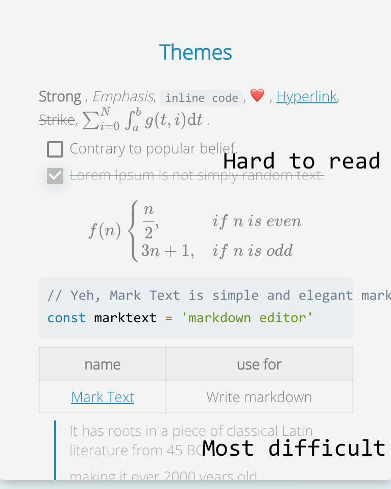
I tried adjusting the css under src/renderer/assets/themes and recompiling but it didn't seem to make any changes. If anyone could give some pointers that would be great! I agree that the low contrast makes some themes hard to use.

I like this theme, "material dark". But as you can see, the contrast is a lot lower than the next screenshot of the "dark" theme.
Screenshot of Mark Text (5-8-20, 9-53-08 AM)

Dark:
Screenshot of Mark Text (5-8-20, 9-53-19 AM)

@brimwats1
Copy link

This would be easily fixable with an easier-to-use theme system—it would be very easy to create a readable solarized or gruvbox dark and light theme, for example.

@YalandHong
Copy link

This would be easily fixable with an easier-to-use theme system—it would be very easy to create a readable solarized or gruvbox dark and light theme, for example.

If you mean custom CSS theme, track #174

@brimwats1
Copy link

@YalandHong thanks for the tip! a fix there would partially fix this—I think you could close this with a theme that passed WCAG AA or AAA. See: https://accessible-colors.com

Sign up for free to join this conversation on GitHub. Already have an account? Sign in to comment
Labels
🐤 blocked/need info Need more details about this issue or pull request 🦁 need discuss the issue or PR need to discuss
Projects
None yet
Development

No branches or pull requests

6 participants